Thursday, 19 December 2013

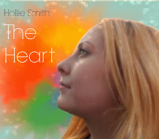
Digipak cover drafts 2, 3, 4 and 5

Effect Change

2nd face colour changes
I liked this version much better once I had increased the temperature and contrast on Pic Monkey. I decided to erase the hearts from her face because I thought it distracted too much and looked weird.

Face colour changes
Using Pixlr, I lightened the image but thought that it had a colder look to the face and thought there needed to be more contrast. 

1st Image with background change
This is the first draft with a colourful background but using the lightly edited face, of my talent, I found that my talent looked very dark in comparison when I wanted to create a sense of light and happiness. In order to fix this I edited the image further as seen above.

Tuesday, 17 December 2013

6th digipak cover draft


Once I had done my 5th draft, I was happy with the outcome and then moved onto the digipak inside. When I was happy with it I released that the digipak cover and the inside didn't have a common theme and so I changed the album inside to have more blue in the background and the digipak cover to have a slightly darker tone to it. Also, due to audience feed back, I will also change the writing of 'Hollie Smith' to white.

Thursday, 12 December 2013

Music video draft

This is the first draft of my music video. Although I am happy with how it's turning out, I still need to add extra filming and my animation. I am disappointed that I was unable to get rid of the light underneath the curtain in both bedroom clips but I have tried to fix the problem with Final Cut Pro with no success. Also, the scene which plays when the lines 'Everytime you eat' the lighting was quite dark when filming and I haven't been able to make it look like a warm and sunny day using Colour Correction.

Tuesday, 10 December 2013

1st Magazine Advert draft

Experimenting still with the digipak cover, I tried to imitate what other magazine adverts had done. I put my digipak cover at the top and filling most of the page with a block of one colour for writing to give information about release dates, etc. I feel that this is rather basic and not very interesting for a reader looking in a magazine, therefore I will look into the magazine advert once I have a digipak to base it on.


Plan for Ancillary tasks- Magazine Advertisement


Largely black in colour, the magazine advertisement for Jessie J's album is very contrasting. With background behind her white and Jessie J's pale skin tone, she stands out from the black clothing and bottom section of the page. The large, gold 'Jessie J' indicates that the advertisement is trying to get the attention of the reader to be on the artist, as she is well known ... 

Unlike the previous example, the advertisement is trying to gain attention by using bright colours instead of very contrasting ones. Also, this advertisement depicts an ocean whereas the other had the artist as the main focus. This may be because this album is by band and do not want to have a single person on the cover, or because they're album is of alternative genre. Both seem to have the CD case on the front with a block colour underneath to include reviews, extra information about the CD or release dates.
This album is very colourful and suggests an alternative genre as it is unusual and doesn't concentrate on an artist/s. The block of blue at the bottom on the page ties in with the main colours of the digipak, blue and green, as well as it not being very in focus.
I like the surreal sense from this magazine advert and the way it has reviews at the bottom


Again, this advertisement has a lot of black on the page, like the first example, but it also contrasted by another colour mainly being white. Also like the Jessie J magazine advert the name of the artist/s is large, in the centre of the page. However, unlike the first advert, this one has a lot of bright colours from the centre. From closer inspection, it is clear to see that the images are coming from a person with there arms out to the side, in the position of a cross. From the name of the album 'Hold Me Down' it can be assumed that the advertisement is suggesting that the images and colours within the individual have been kept inside them and now they are being released. Like the other two examples it has a block colour at the bottom for information, such as the release date. This album seems to be from the rock genre as it uses a lot of black in the background but has a burst of colour which suggests the alternative genre as well.
From this advertisement, I like the way the colours have a theme and the release date being large because it shows the reader the main information after the band name. I also like how the name of the album and band are in the centre of the page because it draws the focus inwards, even with the colour. I will try to use these elements in my own work.

Friday, 6 December 2013

1st Digipak draft

1st complete digipak
As the video has two hearts connected by a message, I thought it would look nice to have them both on the digipack cover to show the link between video and CD case. I thought the writing would look best in white to not be too similar to the red heart next to it. I drew the heart on My Paint and copied them onto the digipak. I think this links well with my animation but I still want more colour.
 
5th changes

Going back to the 1st effect, I changed the background colour as to highlight the heart on the image. I then changed the writing of 'Hollie Smith' to white to go with the new colour of blue. Although I really liked this cover I felt that there was somthing missing to it. I have mentioned in my previous investigation into other digipaks that I would like to use bright colours to show happiness but none were present here. I tried out a full digipak notheless.
 
4th changes
The 2nd effect that I tried was 'Radience'. I was trying to create a sense of sunshine to the image and so used this effect to try and achieve that. It didn't work. I believe that the effect didn't work because it took away too much from the face and the writing. I also find that it looks a little odd and not like a digipak cover.
 
3rd changes
After cropping the image to make it more square shape, as a digipak cover it, I tried out a couple of effects. This effect is 'boken shapes'. I changed the shapes to a heart to go with the theme and added the extra 'glow' that was optional to the effect. I liked this effect but because the background was so light it wasn't very noticable. I also used the 'eyebrow pencil' effect on picmonkey to make her pupils darker and her eye make up. I thought the boken shapes effet took away from the colour of her eyes and so used the eyebrow pencil effect to highlight them.
 
2nd changes
Next, I increased the 'temperature' to create a warmer feel as I thought the song and album would be very light hearted and the original image looked a bit pale to be a pop genre album. I then added the name of the album and artist. I used red because of the connotation to a heart and green because it went well with the other two colours. 
 
1st change
I removed the background from the image and used to picmonkey.com to make the following changes to the picture.
 
Original picture \/

This is the original picture that I took for my digipak. Although it's not the image I originally was going to use for the cover, I looked at other digipaks and thought that the genre I am going for tends to have an individual on the front, usually the artist/s. I didn't want to have it that way but I thought the genre will not be fully conveyed without it.

Friday, 29 November 2013

Plan for Ancillary tasks- Digipak

For my digipak cover, I don't want to use a picture from my music video as I don't think I could find an image that could fully represent the idea from the song and the video. Instead I will look into creating a bright front cover that is drawn on a program called My Paint, which allows for the work to look as though it has been hand drawn. I think this will be easier to use as I won't have any visible mistakes on my digipak and the images will already be computer based.
An example of a digipak style is when a single picture goes across two or more sides. This displays a large landscape image because the maker may want to send a clearer message. For example, in the digipak above it has a sunset at a beach across both sides which conveys relaxation and romance. This is because individuals usually associate a beach with a holiday or time away from working as well as films/media products representing sunsets as a event couples/young lovers watch together.
I feel that having the image on its own better creates this idea because there is no other picture to distract or create any other messages.
For my digipak I would like to have a image that spreads onto 2 or more side just because I like the look just one photo across the whole digipak. As well, I think it would allow me to show the message I want to convey in a single image.

On this digipak, there is a plain yellow cover with a bright, multicoloured inside. On the front there is what may be a logo, possibly for a band or is symbolic of the CDs content. It conveys the genre is light rock as the logo resembles a tattoo. Also the colours are not dark and grungy which shows that this is not a rock or heavy rock album. On this particular CD there is a black print of a child with a speech bubble with a love heart depicted inside. This suggests that the album is about love but perhaps more about the innocent and unconditional love that children feel, as there is a child instead of an adult on the CD. The multicoloured inside of the digipak conveys happiness as it's just a burst of colour. 
What I like about the album is that there is no artist on the front which is typical of modern digipak covers, especially with the pop genre. As I am trying to be unconventional with my type of music video, for example not having a love story and no sexual meaning behind it, I want to make an irregular digipak which suggests the message behind my video. 

Colour Correction

Original Shot
 After Colour Correction

Using Colour Correction I increased the Saturation to make the shot brighter. I did this because I wanted to make it look sunnier and therefore more positive. Although it's only a small change, I feel like it makes a big difference to the look and feel of the shot. Instead of it looking like a dull street, it looks warm and conveys a happy summertime feel.
I have done this with all of the shots of the two girls together to symbolise the importance of it. When the Girl is alone I have made the shots darker, also using Colour Correct, to suggest that without the heart she isn't happy.

Friday, 22 November 2013

Editing Schedule

Throughout October and November I will edit and film all of my footage on Final Cut Pro. As I need to  film in different locations, I haven't been able to get all of my filming done in one go.
When editing a piece of film, I am always going to start with getting the times correct for the slot of music I want to fill. Once the timing is exact, I can then move onto making smaller tweaks such as colour correction and changing any positioning so that it looks better.
Throughout October I will have finished my filming that involves my talent so that I can do anything filming that I need to make afterwards.
In November, I will do all the filming that I need to create, such as any animation I explore and playing the guitar. I will also start my ancillary tasks, a digipak and a magazine advert, in November so that I can add the finishing touches and am able to create my evaluation in December.

Ideology

The ideology behind my music video is that once you accept yourself for who you are you can learn to love yourself. The concept is very cliche but I feel that with a comedy element to the video the message will be put across better than simply saying it.
A lot of music videos are male dominated, whether it be a male artist singing/rapping about women in a derogatory way (Robin Thicke- Blurred Lines) or females dancing provocatively (Rihanna- Pour it Up) and exploiting the Male Graze theory for hyped publicity of their work. I find this demeaning to women and gives an unfair representation of the gender. This is why I wanted to make my video in a purely non sexual way and by only having actresses it removes the idea that this is a romantic message or one of sexual direction and therefore my target audience can concentrate more on the message of the video.
I want to convey a positive concept every time the Girl and the Heart are in shot together to suggest happiness when the Girl has her friend. For this I will brighten up the shot using colour corrector and to contrast this, take some colour away when she is on her own.

Thursday, 10 October 2013

Reshooting

I have done a lot of my filming for my music video last week but there are some scenes that I have filmed and they don't work. For example when I filmed 'the heart' taping the window to represent her rhythm being soothing (like the lyrics in the 2nd verse) but her arm covered the girls face and looked odd.
I also want to reshoot the lines 'Everytime you laugh' because the clip isn't long enough to fit in the time frame and 'Everytime you eat' for the same reason.

Friday, 4 October 2013

Target Audience

My target audience:
Age: 15- 25
Gender: Female
Lifestyle: Socialing, studies.
Interests: Acoustic/pop songs, fashion, play guitar or hobby similar.
Socio-economic group: E
I have chosen this target audience because the group is quite conventional because the group size tends to be large because of the large age range and this group tends to spend a lot of time listening to music, on phones, IPods, etc. There isn't a gap in the market for this audience but I think by going with a popular genre there will be more incentive to watch the video as it's the genre they like. I am appealing to mass audience because of the style of the video and genre of the song but the fan base for Kina Grannis isn't very large compared to artists such as Lady GaGa or Katy Perry.

Ancillary tasks

Whilst filming for my music video, I also have to take into consideration the two subsidiary tasks which are to create a digipak and to make an advertisement for my digipak in a magazine.
Whilst filming I will take pictures that can appear on my digipak and advert. I will need to take at least 4-6 pictures for my digipak depending on whether I will make a 2 piece cover or a 3. As the magazine advert will be to promote the digipak, the picture used in the magazine will be the same (or similar to) as the front cover of the digipak to allow consistency for the consumer.
Although these two examples aren't aimed towards my target audience, I thought I should look at a varied amount to get an idea on how to layout the advertisement in relation to the digipak cover. 
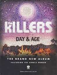
Although these two examples aren't aimed towards my target audience, I thought I should look at a varied amount to get an idea on how to layout the advertisement in relation to the digipak cover. From this first example the digipak and the advert are very similar. Although the writing is a different colour 
in each, such as the white 'The Killers in the advert whereas the digipak has pink, the colours are the same (the first image is a little discoloured). The design of the album implies a fantasy feel from the bright colours but also fire, or some kind of destruction, might be suggested from the orange at the bottom. The idea of a fire could then create the idea that the album is about paradise being ruined, perhaps.
 
Plan B's magazine advert 'The Defamation of Strickland Banks' has similar aspects to the album cover, for example, the red writing and the darkness around the individual. The two have a theme of stage performance, such as in the advert the individual seems to resemble Elvis Presley from the mic that was used mainly during the 1960's and the clothes. Also in the album cover their is an individual with some implication that they perform. The single light on the man with the darkness around him suggests isolation and a sadness to the album. The name of the album is on a board used for theatres with ties in with the idea of the album being about a performer. 
After looking at these two examples, I have seen that I need to select a running theme between both my digipak and the magazine advert. From The Killers example, I can consider making my subsidiary tasks very similar and just add the details of it being a new single to the advert. However, I could also select a theme, like implying the album is about a performer in the Plan B example, to put in both my tasks. I think I prefer the idea of having a running theme but I think I will look more into it once I have taken some pictures whilst filming. 

Colour test

As my video is supposed to be set on a sunny day so I was worried if any dark storm cloud descended that they would ruin all my filming. This is a short clip of a test I did on Final Cut Pro which involves changing the colour and brightness of the clip. Although, I filmed the clip on a sunny day I was able to change the colour so that it looked more like summer than just a bright morning. The change is only slight but I think it looks better and feel more confident about the weather whilst filming.

Friday, 13 September 2013

Shooting schedule

Order of shooting

Wickstead Park- this where the chase scene is being filmed as I wanted to use a large field for a typical 'run on, run off' chase between the heart and the girl. As the rest of the filming is being done in or around the house, I would like to get this scene done first so I can shoot the rest in one location instead of going back and forth.
Date- 5/10/13

Bedroom- The video is going to start in a bedroom where there is a long mirror. There is also two other scenes in the room, where the girl is trying to read and where the heart is helping her get ready for bed, which I would film just after each other.
Date- 5/10/13

Living room- The scenes in this room are where the girl first reads the letter, when the heart is painting with red paint (taking blood and making art), when they have lunch together and there is also the scene where they watch a sad film together.
Date- 5/10/13

Hallway- There are only two short clips of them walking in and out of the house and these will be filmed one after the other.
Date- 5/10/13

Outside the house- When the girl first leaves the house to go out but is then pursued and then when she comes back with the heart still with her.
 Date- 5/10/13

Street- Whilst the girl is running from the heart I will shoot some panning and wide shots of the two running from the house towards, and then in, Wickstead Park.
Date- 5/10/13

Extra shooting
As I am not sure whether I would like some footage of a guitar being played within the song, I plan to film it anyway and experiment with it to see if it enhances the video or seems misplaced.
Drawn hearts will also be filmed on this day.
Date- 1/10/13

Music Videos for inspiration

Narrative videos

A-ha Take On Me

In this music video, I like the drawn people and the way it switches between the effect and real camerawork. The main purpose of the drawings are to create a story line which I feel is effectively done. A wide shot of the long corridor meeting an end for the two main characters adds suspense and drama as we have the perspective of 'the chaser' and feel as though we are closing in on them. Also, the close ups of him hitting the walls and flickering between drawn and flesh create a sense of desperation as they are edited with quick cuts, showing her face of worry. I like this effect as it really adds more to the music video and makes an interesting story line.
For the beginning of my video there is a small drum beat and then at the end there is the sound of a heart beat. I was going to leave these two parts without film but, from the drawn effect in this video, I am now thinking of drawing two hearts, a small and a larger one, to create the effect of the heart beating.


All American Rejects- Give you hell
Around the beginning of this video I panning shot is used to show the difference between the two men featured in the video. As the lights turn off in one house, the lights are turned on in another. The type of shot along with the use of mise en scene (it being night and the decoration of the houses) indicate that the men are completely different in style of clothing and behaviour. I like this shot as it sets the scene for the rest of the video, suggesting there will be conflict between the two houses. Also, the ways in which the two men are dressed show their different personalities, for example one has very neat and combed back hair suggesting he is from an upper class stereotype.
I like the way in which the characters at the start don't get along but things are resolved between the two towards the end (even if it does mean swapping partners!) I would like to use this idea of two characters starting at unease together and then resolving matter towards the end.I also liked the comedy in this video and the small amount of live performance. I feel that adding some live performance would enhance my piece as it a convention that I can follow.

Music video plan

I am going to make my music video to the song Message from your heart by Kina Grannis in a narrative style.
My main idea for the video is to display the moral of to love yourself. As the song lyrics are from a 'hearts' perspective, I have decided to have a girl who is followed by another girl in a heart t-shirt. This would mean that the personified heart would become a literal heart that would at first come across as weird to the girl, because at first she doesn't like herself, but as the song goes on the girl and the heart would become almost friends, to represent her growing the love herself.
The video will be in a narrative style as the message of the video implies progression which would be easily shown through a story. I would like to have parts where there is some performance or scenes of nature and sunlight as the song is quite upbeat and is of pop/acoustic style.

Description:
At the start of the video, the Girl will be looking at her reflection and showing she doesn't like herself by her facial expression. It cuts to her looking on her dining table which has a note addressed to her. As she reads, the lyrics of the first verse are mimed by her until 'I don't work for free' where she places the note back and walks away. As the Girl walks through her corridor a female in a Heart t shirt is behind her singing the last lyrics of the verse 'Please take care of me.'
The chorus starts, the heart person starts talking to the Girl (miming the chorus lyrics). The Girl is frightened so runs. There will be a chase scene during the chorus.
The second verse will begin with the two walking back to the Girl's house and entering the house, the Girl is exhausted but the Heart is fine. The lyrics 'My rhythm soothing like raindrops steady on foggy windows as you gaze outwardly.' will be acted out by the Girl looking out of the window and then giving the Heart weird looks as is starts tapping on the window.
Chorus two will begin with the Girl receiving a text message from the Heart, see the Heart using red paint to make a picture (which is to act out the lyrics 'taking blood and making art). 'Pounding away into the dark' will be acted out by the Heart making noise while the girl is reading.
Throughout the last lyrics the Heart mimes the 'bump bump bump' wherever they are. Where it begins 'Everytime you sleep.' the Heart is making the bed for the Girl. This is the point where the Girl is starting to be more comfortable with the Heart. 'Everytime you eat'- Heart preparing lunch. 'Everytime you laugh' the Girl and Heart laughing together. 'Everytime you cry' they're watching a sad film and the Heart's comforting her. And finally, 'Everytime you love' the Girl is looking around for the Heart and as she does she goes past her appearance but this time she likes is. The last shot is of the note from the begining saying 'This is a message from your heart.'

I hope this idea is rather comical and shows the moral of to love yourself.

Thursday, 12 September 2013

Theorists of music videos

Sven E Carlsson- "One of the most common methods of analysis is to break up the music video into black and white boxes. Almost everything is then perceived as opposites- trash or art, commerce or creativity, male of female, naturalism or antirealism, etc."
Carlsson also believes that there are two main categories music videos fall into:
  1. Performance- the audience are able to see the artist(s) singing and dancing.
  2. Conceptual- the audience watch something other than the artist. 
Carlsson created the theory of 'Modern mythic embodiment' where in a video the performer no longer is a performer and become a 'product'. "He or she is a materialisation of the commercial exhibionist. He or she is a monger of their own body image, selling everything to be in the spotlight- selling voice, face, lifestyle, records and so on."

Michael Shore believes music videos are recycled styles that contains an information overload and some adolescent male fantasies, with elements of speed, power, girls and wealth. He goes onto say that some videos contain soft core pornography and cliched imagery. 

Beyonce- Run the World would be a music video that would support Shore's theory as throughout the women featured in the video dance in revealing outfits with sexual dance moves. Although the song is about female empowerment, the video comes across as a performance for the males who are then saluted at the end, in a way soldiers would salut their commanding officers.

Imagine Dragons- Radioactive supports Carlsson theory that there are videos with elements to it as well as seeing the artist perform and would come under the conceptual category.
I think I would like to film a conceptual video as I could find a song with a story or message to it and create a video based around it. 

Friday, 12 July 2013

1 minute video evaluation

Creativity- Initially I wanted to create a short film about the day in the life of a penny but as time went on I couldn't think of many ideas for it. So instead I made a video at my school where it would be easy to get 'extras' to be in the background. I have learnt for my next project to plan my ideas in advance so I can do a film idea I would rather do. I thought it would be comical to have the students 'escaping' the horrors of the crowded corridor as it is usually a task in the mornings of a normal school day. Also, many pupils don't like having the go from A floor, the bottom, to D floor and so I thought I would incorporate this into the film.

Research and planning- For planning, I made a story board of how to start a day in the life of a lost student. I had looked at a short film called 'The Desk' which was also set in a school and took ideas from that. I continued with my idea that the student should be lost and, as the school B floor corridor is usually very crowded, they should have some troubles with that for comical purposes.

Use of real media conventions- In 'The Desk' it starts with an establishing shot and so I wanted to show the heights of the stairs I was about to climb. I found it harder to get the whole school in a single shot so I panned up so more of the school could be seen, in a sort of establishing shot. Like in Awake he uses a point of view shot to show the emptiness of the street. I thought this should his isolation and so I thought using this would show the persons isolation whilst being lost. However, I used this shot throughout the whole piece.

Digital technology and Post-production- I filmed my piece in three longer takes. One, make my way to the top of the stairs to look in classrooms, once when I see Sarah down the corridor and another when I ran out of the school from the crowded corridor. On Final Cut Pro I learnt how to use Cross Dissolve to merge the scenes together so that there was a better flow to the piece. I also learnt how to use 'blade' with allows sections of a bit of film of music to become separated from the original piece of film. I used the blade tool when I wanted to fast forward the section where I climb the stairs so that just one bit was faster. I did the same effect when I run out of the school just to make the 'escape' more emphasised.
To create a voice over, I recorded what I want to say on 'GarageBand', saved it and then copied it onto my video.

Textual analysis

Camerawork
POV, throughout- creates a personal experience
Pan up- to show the height of the school

Editing techniques
Fast forward- to show that the time taken to climb the stairs was long
Cross dissolve- give the illusion of time passing

Sound
Voice over- thoughts of the student
Pupils talking to each other- acknowledgment of moved classroom
Background noise of other students

Mise en scene
Text book, held by Sarah
School
Pupils in corridor

Wednesday, 10 July 2013

A day in the life of a lost student

This is my finished 1 minute video. I thought putting 'lost' into the title explained the story line better.

Friday, 28 June 2013

A day in the life of a student

I plan to use a point of view shot to film the student walking to their lesson and use a voice over of their thoughts to show their opinion on what they're doing.
I plan to start the film with the student trying to find their timetable but not being able to. They think that their lesson is on D floor, the highest floor in the school, but find that it isn't after they have climbed all the flights of stairs. They find a friend and find out their lesson is on B floor... only to see the very crowded corridor where their friend runs away from the crowd and leaves them alone to fight the crowd of students.
I hope this video will be seen a comedy from the content I include in it.

Tuesday, 25 June 2013

Research

To get a concept of the conventions used in short films I watched two short films. One is called 'The Desk' and the other is 'Awake'.

The Desk
Camerawork
Establishing shot
Mid shot of character looking lost
Close ups of his timetable and room number
Wide shot of classroom to establish the layout
Close up of girl, then his face to show crush
Mid shot of when he sees the writing on the desk and is in shock
Close up of note

Editing techniques 
Making the words fade onto the desk
Cuts

Sound
Piano music

Mise en scene
School
Lockers
The desk
Change in clothes of the boy

Target Audience
Age- 15-21
Gender- Female
Socio-economic group- Students, unemployed.
Lifestyle- Students, spend free time on youtube, interested in short films

Awake
Camerawork
Extreme close up of eye
POV of empty street
Close up of breakfast, eating alone
Tracking shot of feet walking alone
Close up of gnome doing 'activities' with him
Shot of grandad with weapon
Pan out of newspaper article

Editing techniques
Cuts

Sound
Voice over
Sinister music

Mise en scene
Boy alone
Messy clothes pile
Empty streets
Abandoned cars
Gnome

Target Audience
Age- 15-21
Gender- Both
Socio-economic group- Students, unemployed.
Lifestyle- Students, spend free time on youtube, interested in short films

Tuesday, 18 June 2013

Welcome

For my A2 media project I will be making either a short film or a music video.
As for now I am making a 1 minute film entitled 'A day in the life of...' to enable me to use the equipment, such as a camera and editing, to make my film/music video. 
I have chosen to do A day in the life of a student and use a voice over of the thoughts.