Effect Change
2nd face colour changes
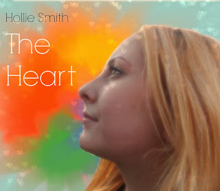
I liked this version much better once I had increased the temperature and contrast on Pic Monkey. I decided to erase the hearts from her face because I thought it distracted too much and looked weird.
Face colour changes
Using Pixlr, I lightened the image but thought that it had a colder look to the face and thought there needed to be more contrast.
1st Image with background change
This is the first draft with a colourful background but using the lightly edited face, of my talent, I found that my talent looked very dark in comparison when I wanted to create a sense of light and happiness. In order to fix this I edited the image further as seen above.


It's really good to see someone spending so long on their subsidiary tasks. When it comes to evaluating the work, make sure you think hard about how the advert and digipack work in synergy with the video.
ReplyDelete