Friday, 29 November 2013

Plan for Ancillary tasks- Digipak

For my digipak cover, I don't want to use a picture from my music video as I don't think I could find an image that could fully represent the idea from the song and the video. Instead I will look into creating a bright front cover that is drawn on a program called My Paint, which allows for the work to look as though it has been hand drawn. I think this will be easier to use as I won't have any visible mistakes on my digipak and the images will already be computer based.
An example of a digipak style is when a single picture goes across two or more sides. This displays a large landscape image because the maker may want to send a clearer message. For example, in the digipak above it has a sunset at a beach across both sides which conveys relaxation and romance. This is because individuals usually associate a beach with a holiday or time away from working as well as films/media products representing sunsets as a event couples/young lovers watch together.
I feel that having the image on its own better creates this idea because there is no other picture to distract or create any other messages.
For my digipak I would like to have a image that spreads onto 2 or more side just because I like the look just one photo across the whole digipak. As well, I think it would allow me to show the message I want to convey in a single image.

On this digipak, there is a plain yellow cover with a bright, multicoloured inside. On the front there is what may be a logo, possibly for a band or is symbolic of the CDs content. It conveys the genre is light rock as the logo resembles a tattoo. Also the colours are not dark and grungy which shows that this is not a rock or heavy rock album. On this particular CD there is a black print of a child with a speech bubble with a love heart depicted inside. This suggests that the album is about love but perhaps more about the innocent and unconditional love that children feel, as there is a child instead of an adult on the CD. The multicoloured inside of the digipak conveys happiness as it's just a burst of colour. 
What I like about the album is that there is no artist on the front which is typical of modern digipak covers, especially with the pop genre. As I am trying to be unconventional with my type of music video, for example not having a love story and no sexual meaning behind it, I want to make an irregular digipak which suggests the message behind my video. 

Colour Correction

Original Shot
 After Colour Correction

Using Colour Correction I increased the Saturation to make the shot brighter. I did this because I wanted to make it look sunnier and therefore more positive. Although it's only a small change, I feel like it makes a big difference to the look and feel of the shot. Instead of it looking like a dull street, it looks warm and conveys a happy summertime feel.
I have done this with all of the shots of the two girls together to symbolise the importance of it. When the Girl is alone I have made the shots darker, also using Colour Correct, to suggest that without the heart she isn't happy.

Friday, 22 November 2013

Editing Schedule

Throughout October and November I will edit and film all of my footage on Final Cut Pro. As I need to  film in different locations, I haven't been able to get all of my filming done in one go.
When editing a piece of film, I am always going to start with getting the times correct for the slot of music I want to fill. Once the timing is exact, I can then move onto making smaller tweaks such as colour correction and changing any positioning so that it looks better.
Throughout October I will have finished my filming that involves my talent so that I can do anything filming that I need to make afterwards.
In November, I will do all the filming that I need to create, such as any animation I explore and playing the guitar. I will also start my ancillary tasks, a digipak and a magazine advert, in November so that I can add the finishing touches and am able to create my evaluation in December.

Ideology

The ideology behind my music video is that once you accept yourself for who you are you can learn to love yourself. The concept is very cliche but I feel that with a comedy element to the video the message will be put across better than simply saying it.
A lot of music videos are male dominated, whether it be a male artist singing/rapping about women in a derogatory way (Robin Thicke- Blurred Lines) or females dancing provocatively (Rihanna- Pour it Up) and exploiting the Male Graze theory for hyped publicity of their work. I find this demeaning to women and gives an unfair representation of the gender. This is why I wanted to make my video in a purely non sexual way and by only having actresses it removes the idea that this is a romantic message or one of sexual direction and therefore my target audience can concentrate more on the message of the video.
I want to convey a positive concept every time the Girl and the Heart are in shot together to suggest happiness when the Girl has her friend. For this I will brighten up the shot using colour corrector and to contrast this, take some colour away when she is on her own.

Thursday, 10 October 2013

Reshooting

I have done a lot of my filming for my music video last week but there are some scenes that I have filmed and they don't work. For example when I filmed 'the heart' taping the window to represent her rhythm being soothing (like the lyrics in the 2nd verse) but her arm covered the girls face and looked odd.
I also want to reshoot the lines 'Everytime you laugh' because the clip isn't long enough to fit in the time frame and 'Everytime you eat' for the same reason.

Friday, 4 October 2013

Target Audience

My target audience:
Age: 15- 25
Gender: Female
Lifestyle: Socialing, studies.
Interests: Acoustic/pop songs, fashion, play guitar or hobby similar.
Socio-economic group: E
I have chosen this target audience because the group is quite conventional because the group size tends to be large because of the large age range and this group tends to spend a lot of time listening to music, on phones, IPods, etc. There isn't a gap in the market for this audience but I think by going with a popular genre there will be more incentive to watch the video as it's the genre they like. I am appealing to mass audience because of the style of the video and genre of the song but the fan base for Kina Grannis isn't very large compared to artists such as Lady GaGa or Katy Perry.

Ancillary tasks

Whilst filming for my music video, I also have to take into consideration the two subsidiary tasks which are to create a digipak and to make an advertisement for my digipak in a magazine.
Whilst filming I will take pictures that can appear on my digipak and advert. I will need to take at least 4-6 pictures for my digipak depending on whether I will make a 2 piece cover or a 3. As the magazine advert will be to promote the digipak, the picture used in the magazine will be the same (or similar to) as the front cover of the digipak to allow consistency for the consumer.
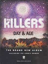
Although these two examples aren't aimed towards my target audience, I thought I should look at a varied amount to get an idea on how to layout the advertisement in relation to the digipak cover. 
Although these two examples aren't aimed towards my target audience, I thought I should look at a varied amount to get an idea on how to layout the advertisement in relation to the digipak cover. From this first example the digipak and the advert are very similar. Although the writing is a different colour 
in each, such as the white 'The Killers in the advert whereas the digipak has pink, the colours are the same (the first image is a little discoloured). The design of the album implies a fantasy feel from the bright colours but also fire, or some kind of destruction, might be suggested from the orange at the bottom. The idea of a fire could then create the idea that the album is about paradise being ruined, perhaps.
 
Plan B's magazine advert 'The Defamation of Strickland Banks' has similar aspects to the album cover, for example, the red writing and the darkness around the individual. The two have a theme of stage performance, such as in the advert the individual seems to resemble Elvis Presley from the mic that was used mainly during the 1960's and the clothes. Also in the album cover their is an individual with some implication that they perform. The single light on the man with the darkness around him suggests isolation and a sadness to the album. The name of the album is on a board used for theatres with ties in with the idea of the album being about a performer. 
After looking at these two examples, I have seen that I need to select a running theme between both my digipak and the magazine advert. From The Killers example, I can consider making my subsidiary tasks very similar and just add the details of it being a new single to the advert. However, I could also select a theme, like implying the album is about a performer in the Plan B example, to put in both my tasks. I think I prefer the idea of having a running theme but I think I will look more into it once I have taken some pictures whilst filming.