Thursday, 19 December 2013

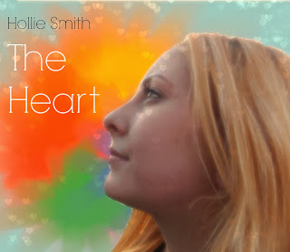
Digipak cover drafts 2, 3, 4 and 5

Effect Change

2nd face colour changes
I liked this version much better once I had increased the temperature and contrast on Pic Monkey. I decided to erase the hearts from her face because I thought it distracted too much and looked weird.

Face colour changes
Using Pixlr, I lightened the image but thought that it had a colder look to the face and thought there needed to be more contrast. 

1st Image with background change
This is the first draft with a colourful background but using the lightly edited face, of my talent, I found that my talent looked very dark in comparison when I wanted to create a sense of light and happiness. In order to fix this I edited the image further as seen above.

Tuesday, 17 December 2013

6th digipak cover draft


Once I had done my 5th draft, I was happy with the outcome and then moved onto the digipak inside. When I was happy with it I released that the digipak cover and the inside didn't have a common theme and so I changed the album inside to have more blue in the background and the digipak cover to have a slightly darker tone to it. Also, due to audience feed back, I will also change the writing of 'Hollie Smith' to white.

Thursday, 12 December 2013

Music video draft

This is the first draft of my music video. Although I am happy with how it's turning out, I still need to add extra filming and my animation. I am disappointed that I was unable to get rid of the light underneath the curtain in both bedroom clips but I have tried to fix the problem with Final Cut Pro with no success. Also, the scene which plays when the lines 'Everytime you eat' the lighting was quite dark when filming and I haven't been able to make it look like a warm and sunny day using Colour Correction.

Tuesday, 10 December 2013

1st Magazine Advert draft

Experimenting still with the digipak cover, I tried to imitate what other magazine adverts had done. I put my digipak cover at the top and filling most of the page with a block of one colour for writing to give information about release dates, etc. I feel that this is rather basic and not very interesting for a reader looking in a magazine, therefore I will look into the magazine advert once I have a digipak to base it on.


Plan for Ancillary tasks- Magazine Advertisement


Largely black in colour, the magazine advertisement for Jessie J's album is very contrasting. With background behind her white and Jessie J's pale skin tone, she stands out from the black clothing and bottom section of the page. The large, gold 'Jessie J' indicates that the advertisement is trying to get the attention of the reader to be on the artist, as she is well known ... 

Unlike the previous example, the advertisement is trying to gain attention by using bright colours instead of very contrasting ones. Also, this advertisement depicts an ocean whereas the other had the artist as the main focus. This may be because this album is by band and do not want to have a single person on the cover, or because they're album is of alternative genre. Both seem to have the CD case on the front with a block colour underneath to include reviews, extra information about the CD or release dates.
This album is very colourful and suggests an alternative genre as it is unusual and doesn't concentrate on an artist/s. The block of blue at the bottom on the page ties in with the main colours of the digipak, blue and green, as well as it not being very in focus.
I like the surreal sense from this magazine advert and the way it has reviews at the bottom


Again, this advertisement has a lot of black on the page, like the first example, but it also contrasted by another colour mainly being white. Also like the Jessie J magazine advert the name of the artist/s is large, in the centre of the page. However, unlike the first advert, this one has a lot of bright colours from the centre. From closer inspection, it is clear to see that the images are coming from a person with there arms out to the side, in the position of a cross. From the name of the album 'Hold Me Down' it can be assumed that the advertisement is suggesting that the images and colours within the individual have been kept inside them and now they are being released. Like the other two examples it has a block colour at the bottom for information, such as the release date. This album seems to be from the rock genre as it uses a lot of black in the background but has a burst of colour which suggests the alternative genre as well.
From this advertisement, I like the way the colours have a theme and the release date being large because it shows the reader the main information after the band name. I also like how the name of the album and band are in the centre of the page because it draws the focus inwards, even with the colour. I will try to use these elements in my own work.

Friday, 6 December 2013

1st Digipak draft

1st complete digipak
As the video has two hearts connected by a message, I thought it would look nice to have them both on the digipack cover to show the link between video and CD case. I thought the writing would look best in white to not be too similar to the red heart next to it. I drew the heart on My Paint and copied them onto the digipak. I think this links well with my animation but I still want more colour.
 
5th changes

Going back to the 1st effect, I changed the background colour as to highlight the heart on the image. I then changed the writing of 'Hollie Smith' to white to go with the new colour of blue. Although I really liked this cover I felt that there was somthing missing to it. I have mentioned in my previous investigation into other digipaks that I would like to use bright colours to show happiness but none were present here. I tried out a full digipak notheless.
 
4th changes
The 2nd effect that I tried was 'Radience'. I was trying to create a sense of sunshine to the image and so used this effect to try and achieve that. It didn't work. I believe that the effect didn't work because it took away too much from the face and the writing. I also find that it looks a little odd and not like a digipak cover.
 
3rd changes
After cropping the image to make it more square shape, as a digipak cover it, I tried out a couple of effects. This effect is 'boken shapes'. I changed the shapes to a heart to go with the theme and added the extra 'glow' that was optional to the effect. I liked this effect but because the background was so light it wasn't very noticable. I also used the 'eyebrow pencil' effect on picmonkey to make her pupils darker and her eye make up. I thought the boken shapes effet took away from the colour of her eyes and so used the eyebrow pencil effect to highlight them.
 
2nd changes
Next, I increased the 'temperature' to create a warmer feel as I thought the song and album would be very light hearted and the original image looked a bit pale to be a pop genre album. I then added the name of the album and artist. I used red because of the connotation to a heart and green because it went well with the other two colours. 
 
1st change
I removed the background from the image and used to picmonkey.com to make the following changes to the picture.
 
Original picture \/

This is the original picture that I took for my digipak. Although it's not the image I originally was going to use for the cover, I looked at other digipaks and thought that the genre I am going for tends to have an individual on the front, usually the artist/s. I didn't want to have it that way but I thought the genre will not be fully conveyed without it.