I have done a lot of my filming for my music video last week but there are some scenes that I have filmed and they don't work. For example when I filmed 'the heart' taping the window to represent her rhythm being soothing (like the lyrics in the 2nd verse) but her arm covered the girls face and looked odd.
I also want to reshoot the lines 'Everytime you laugh' because the clip isn't long enough to fit in the time frame and 'Everytime you eat' for the same reason.
Thursday, 10 October 2013
Friday, 4 October 2013
Target Audience
My target audience:
Age: 15- 25
Gender: Female
Lifestyle: Socialing, studies.
Interests: Acoustic/pop songs, fashion, play guitar or hobby similar.
Socio-economic group: E
I have chosen this target audience because the group is quite conventional because the group size tends to be large because of the large age range and this group tends to spend a lot of time listening to music, on phones, IPods, etc. There isn't a gap in the market for this audience but I think by going with a popular genre there will be more incentive to watch the video as it's the genre they like. I am appealing to mass audience because of the style of the video and genre of the song but the fan base for Kina Grannis isn't very large compared to artists such as Lady GaGa or Katy Perry.
Ancillary tasks
Whilst filming for my music video, I also have to take into consideration the two subsidiary tasks which are to create a digipak and to make an advertisement for my digipak in a magazine.
Whilst filming I will take pictures that can appear on my digipak and advert. I will need to take at least 4-6 pictures for my digipak depending on whether I will make a 2 piece cover or a 3. As the magazine advert will be to promote the digipak, the picture used in the magazine will be the same (or similar to) as the front cover of the digipak to allow consistency for the consumer.
Although these two examples aren't aimed towards my target audience, I thought I should look at a varied amount to get an idea on how to layout the advertisement in relation to the digipak cover.


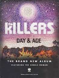
Although these two examples aren't aimed towards my target audience, I thought I should look at a varied amount to get an idea on how to layout the advertisement in relation to the digipak cover. From this first example the digipak and the advert are very similar. Although the writing is a different colour
in each, such as the white 'The Killers in the advert whereas the digipak has pink, the colours are the same (the first image is a little discoloured). The design of the album implies a fantasy feel from the bright colours but also fire, or some kind of destruction, might be suggested from the orange at the bottom. The idea of a fire could then create the idea that the album is about paradise being ruined, perhaps.
Plan B's magazine advert 'The Defamation of Strickland Banks' has similar aspects to the album cover, for example, the red writing and the darkness around the individual. The two have a theme of stage performance, such as in the advert the individual seems to resemble Elvis Presley from the mic that was used mainly during the 1960's and the clothes. Also in the album cover their is an individual with some implication that they perform. The single light on the man with the darkness around him suggests isolation and a sadness to the album. The name of the album is on a board used for theatres with ties in with the idea of the album being about a performer.
After looking at these two examples, I have seen that I need to select a running theme between both my digipak and the magazine advert. From The Killers example, I can consider making my subsidiary tasks very similar and just add the details of it being a new single to the advert. However, I could also select a theme, like implying the album is about a performer in the Plan B example, to put in both my tasks. I think I prefer the idea of having a running theme but I think I will look more into it once I have taken some pictures whilst filming.
Colour test
Subscribe to:
Comments (Atom)

